U.S. equities continue to be a beacon of growth on a year-to-date (YTD) basis. With a YTD performance for the S&P 500 of +11.6%,1 many debate whether drivers of this market rally are macroeconomic numbers, the turnaround in corporate earnings or something else. Is there anything we can say about whether this trend will continue?
I believe our answer may lie in a unique technical pattern that markets have been showing in a post-quantitative easing (QE) world that I will describe below.
Interplay of Market and Diversification
Finance 101 tells us that assets move in unison during stress periods, challenging investors looking for diversification. Correlations can also go up in a rising market, but experience shows us that such rallies are less sustainable in the long run.
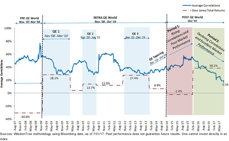
To visualize this interplay of U.S. equities and prevailing average correlations, I plotted the chart below. The chart plots the average of all possible pair-wise trailing six-month correlations of equities in a broad index (i.e., Dow Jones in our analysis). This chart indicates average correlations in the U.S. equity markets at every point in time. The chart is then overlaid with three distinct periods over the last decade:
Average Correlations in a Post-QE World at an All-Time Low
7/30/07–7/30/17
Pre- and Intra-QE World
Immediately before QE, there was a spike of average correlations. This was driven by panic in the market due to the financial crisis, a liquidity crunch and an S&P that declined 30.6% during the period November 2007 through November 2008.2
This led the Federal Reserve (Fed) to come up with its bazooka of massive liquidity injection wrapped as QE. Essentially, in November 2008 the Fed announced that it would purchase up to $600 billion of agency mortgage-backed securities and agency debt, providing the economy with liquidity of $600 billion.3 Correlations reacted sharply and fell while the market immediately cheered by jumping up.








No Comments