I’m normally an optimistic, “glass-half-full” kind of guy. I roll my eyes every time I see a headline decrying the next market crash or cataclysmic event that will cripple the global economy.I’m quick to discern speculation from truths and prefer taking the opposite side of most mainstream assumptions.
It’s not that I see everything through rose colored glasses, but rather that I have found an unruffled approach to be a strong foundation for better decision making.Navigating the markets with a calm and calculated strategy produces far superior returns than simply worrying about what dangers might lurk around every corner.
That being said, there are always areas of risk that I have my eye on.It’s beneficial to know both where the market is showing its strengths and where weakness can undermine those positive qualities. There are currently three charts that are demonstrating worrisome price action that I have categorized as red flags.
Energy Select Sector SPDR (XLE)
XLE is the largest and most well-known energy sector fund with $16.6 billion under management.It tracks a basket of 35 large-cap oil and gas companies that derive their profits from exploration and refinement of liquid commodities.
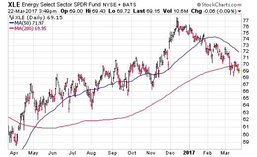
Examining the chart below, it’s obvious that XLE peaked in December 2016 and has been on a slow descent ever since. This index also just recently crossed below its long-term 200-day moving average, which may indicate the start of a new downtrend as crude oil prices touch new year-to-date lows.

From high to low, XLE is down approximately 10% and has been trading in an orderly manner. However, the decoupling from the rest of the market that recently hit new all-time high is a concerning factor that should be noted.
Energy only makes up roughly 6.5% of the broader S&P 500 Index. Nevertheless, the fluctuations in global commodity prices have been known to start ripple effects through other areas of the economy as well.


No Comments