Learn the times of the year when the GBPUSD and British Pound FX futures tend to do well and poorly, based on historical tendency.
Normally we view charts in chronological order, day after day and year after year. This chart type shows the price path of a currency over time and provide a lot of information for technicians to use.
There’s another way to view currency charts, and that’s to look at them in terms of seasonality.
A seasonal chart shows the tendencies of an asset to move higher or lower, or peak and bottom, at certain times of the year.
Instead of looking at the last 15 years of currency data in chronological order, what if you took each one year period, January to December, and printed it on a transparent slide. Then, put each year on top of each other. Doing this would highlight any period of the year which tends to be strong or weak. Luckily, we don’t need to do that. We can take an average of the last 15 or 20 years to show what tends to occur at different times of the year (also see S&P 500 Seasonal Trends).
Below we look at the pattern of British Pound FX futures which will also aid in trading the GBPUSD forex pair.
British Pound Seasonal Patterns
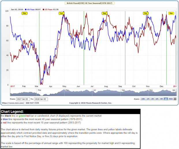
The British Pound has seasonal tendencies, and we can see them by looking at the following seasonal chart of Pound futures, which are traded relative to the USD.
British Pound Seasonal Chart – 15 and 40 Year

Source: MRCI.com
The chart shows the tendencies of the Pound over the last 15 and 40 years. Since the statistics are being calculated over different lengths of time, there are some discrepancies. The longer-term calculation (40) contains more data, while the shorter-term statistic (15) shows what has been happening more recently.


No Comments